Everything a real site needs. Nothing you'd rip out.
A page builder, end-to-end types, CMS theming, blog, SEO, consent and forms — production-grade defaults you'd otherwise spend weeks assembling.
PAGE BUILDER INTERACTIVE
20+ blocks. Composed in Studio.
Editors drag blocks into a page; each maps to a typed Vue component. Filter the library by category — the grid updates live.
Hero: Simple centered
hero.simple
Hero: Side by side image
hero.image
Feature Grid
feature-grid
CTA Banner
cta-banner
Testimonials
testimonials
FAQ / Accordion
faq
Text Block
text-block
Gallery: Three column grid
gallery.base
Carousel (Custom slides)
carousel.slideshow
Logo’s Carousel
carousel.logos
Image
image.component
Youtube Video
youtube-video-embed
Adding your own takes one command: npm run scaffold:component -- custom.my-block writes the schema, the Vue component and the registry entry, then regenerates types.
CMS THEMING
Rebrand from the CMS. No redeploy.
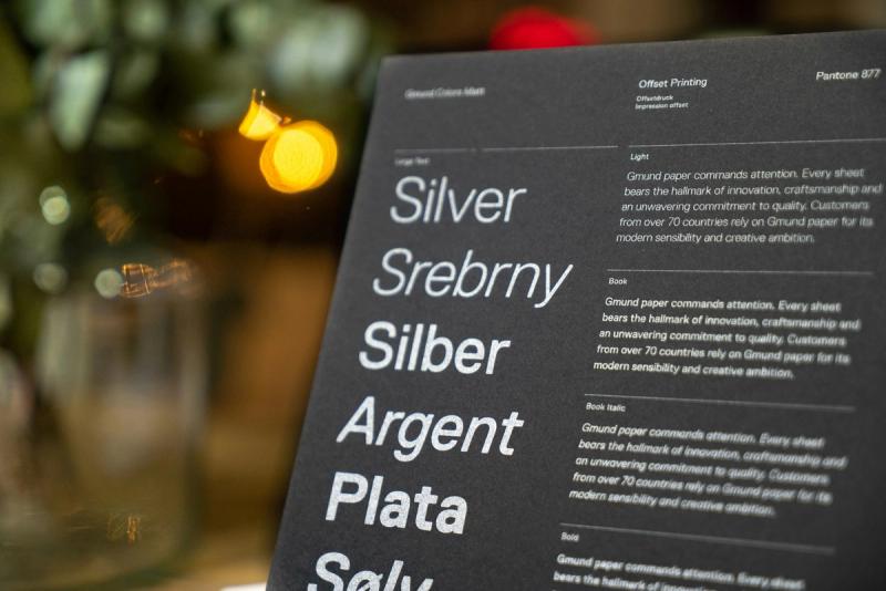
Color themes and font pairings are Sanity documents. At build time they compile to CSS custom properties, so every block inherits the same tokens — change once, restyle everywhere.
Color Palette & Theme pairings as Sanity documents
Compiled to CSS variables at build time
Every block inherits the same tokens
{
  "_type": "color.theme.single",
  "title": "Brand Green",
  "cssvar": { "current": "brand-green" },
  "color": { "hex": "#00dc82" },
  ...
}Site
siteSettings.theme
The default every page starts from.
Page
page.colorOptions.theme
Overrides the site default for one page.
Section
options.colorSource
Each block inherits, or picks its own theme.
THEME PLAYGROUND INTERACTIVE
Preset themes, applied
Each theme is a Sanity document compiled to CSS variables at build time. Click a swatch — the preview re-themes with zero reload.
Build faster with Nuxion
Every block reads the same theme tokens — recolor once, restyle everywhere.
TYPE-SAFE, END TO END
Rename a field. Break the build, not prod.
Sanity TypeGen generates types from your schemas and the component registry is compile-time checked. The whole chain stays in lockstep.

FULL BLOG
A blog, not a bolt-on.
Posts, authors, categories, tags and pagination out of the box — with per-post layout overrides when a story needs its own shape.
Authors, categories, tags & pagination
Per-post layout overrides
Create your own blog layouts
Category-filtered index with typed GROQ pagination
Article JSON-LD generated automatically
FONT PAIRING SWITCHER INTERACTIVE
Fonts are documents too.
Select a pairing — the type scale below updates in place. In Studio these map to a fonts document compiled into the theme's CSS variables.
Design that scales
A confident heading pairing
Section subhead level three
Body copy renders in the paired body face. Nuxion keeps heading and body families in sync across every block, so your type system stays coherent whether an editor drops in a hero, a blog post, or a pricing table.
FORMS INTERACTIVE
Build a form. Watch the code write itself.
Every input type ships styled, validated and theme-aware. Add fields below — the preview and the builder code update together, exactly as they would in your editor.
Contact us
import { buildForm, textField, emailField, textareaField, checkboxField } from '~/services/forms/formBuilder'
const form = buildForm({
    title: 'Contact us',
    columns: '2x2',
    fields: [
        textField({ modelId: 'name', label: 'Full name', placeholder: 'Ada Lovelace', required: true, columnSpan: 1 }),
        emailField({ modelId: 'email', label: 'Email', placeholder: 'ada@example.com', required: true, columnSpan: 1 }),
        textareaField({ modelId: 'message', label: 'Message', placeholder: 'Tell us about your project…', required: true }),
        checkboxField({ modelId: 'consent', label: 'Keep me posted about product updates' }),
    ],
})
This is a live demo — nothing is submitted. In a real Form Block each submission is stored as a Sanity document and optionally forwarded to Web3Forms or your own Resend endpoint.
THE REST OF THE PLATFORM
Production concerns, already handled.
The unglamorous work that eats your first two sprints — redirects, consent, previews, submissions, CI — wired up before you write a line.
CMS redirects
301/302 managed in Studio, applied at build time — no code changes.
GDPR consent
Banner copy in Studio, automatic script blocking by category.
Live draft preview
Edit and see it instantly via the Sanity Live Content API.
Swappable forms
Web3Forms or first-party Resend endpoint, honeypot spam protection.
Form submissions
Every submission stored as a Sanity document you can query and export.
CI & testing
Vitest units, e2e coverage and a CI pipeline wired from day one.
DEVELOPER EXPERIENCE
One command. One terminal.
Setup, dev, and scaffolding are single commands. The scaffolder generates schema + typed Vue component + registration in one step. Vitest, e2e and CI ship in the box.
npm run setup:project
✔ env linked · types generated · dev ready

npm run scaffold:component -- custom.testimonial
✔ schema/custom.testimonial.ts
✔ components/custom/CustomTestimonial.vue
✔ registered in customComponentImports

cd studio && npm run schema:types
✓ schema types → sanity.types.ts
Stop customizing templates.
Start shipping brands.
Everything above just ran live on this page. Now picture it running yours.